In the Library, when we bought the house, the walls were ivory anaglypta, a floral border, a mauve upper portion of the wall and ceiling. I’m not sure when the decor in here was done, but it feels very 1990s to me, which was when some of the other cosmetic changes in the house happened. So that seems likely!
Being a fan of color and patterns (and pattern mixing) I actually do love the Victorian trait of using a border / wallpaper / wainscoting to break up a space and allow for more features. And the rooms are big enough to handle it. While I LOVED the anaglypta, the floral wallpaper is not my jam. It’s just a bit too….. saccharin?
My dad always laughs at me when I say things are too dated. “Seriously, girl, have you seen your house?” BUT THIS IS NOT THE RIGHT KIND OF DATED. Like, dated 1902 is fine. But at the same time, we’re not making a museum, and I feel like what we’re doing is a modern version of what Victorian Style encompasses, so maybe it IS dated and will be terrible in several years.
Regardless – I don’t like this border. At All.
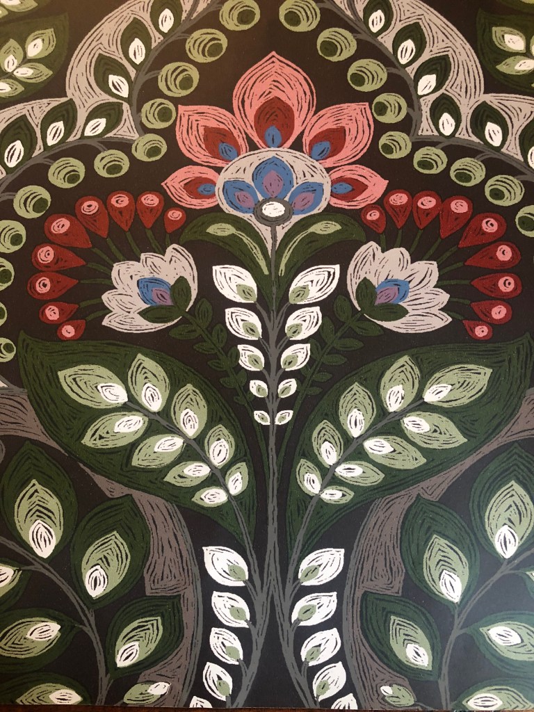
So my plan was to find a wallpaper that I could use to go from the top of the anaglypta to the ceiling (so, a SUPER wide border), and we’ll add a picture rail in between, and crown moulding on top. The paper is from Brewster Wallcoverings – and I love that up close, it looks like it’s been hand drawn with markers. The colors are so perfect.
I used to never get wallpaper samples, but now I ALWAYS do – because sometimes wallpapers look terrible compared to what you see on the screen, and other times, like this, they look so much better in real life, and you know you’ve made a good choice. This is my kind of floral.
Ready to install!
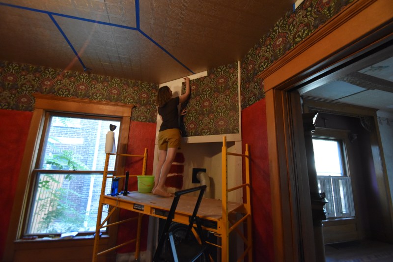
Once again – the world is a better place because we have scaffolding.
Controversy Time! We did not remove the border before we hung the wallpaper. If someone ever buys this house from us and discovers that there are layers of wallpaper, please PLEASE PLEASE tell them we weren’t lazy. Normally, we would never do this. However, I was super worried about what collateral damage we would do to the anaglypta if we tried to remove the old border. So we decided, since it wasn’t peeling and it good shape, we would leave it up there, to make sure that the anaglypta also stayed safe and sound and in place.
So fun seeing it take shape!
Wrapping around the corner. I also love how the colors complement the dining room so well, without exactly matching.
LOVE THIS with the woodwork.
These two REALLY wanted to supervise, but for now, they are still baby-gate exiled from the new floors. There’s just too much construction stuff and while they may need emotional support to deal with the trauma, we think they’ll be okay in the long run. Lots of side-eye from these two.
Imagining a ceiling above with beams, and crown moulding and picture rail is just SO EXCITING!
Speaking of crown moulding, I used some wallpaper scraps to help visualize how big we wanted it to be – basically, how much of the wallpaper pattern I was willing to cover. From left to right, these are 3″ – 4″ – 5″ – and 6″. Right now, we’re leaning towards 5 inches.
Oooof. Check out that paint job towards the beginning.
Here’s a fun mystery that we haven’t solved – there is some writing on the top of the window header. It’s either paint, or some type of glue (it seems like glue?). We think it says “C. Ford 1923.” Or, “E. Ford 1928.”
What do you think?
Super hard to decipher. Another mystery to solve!
Looking into the parlor.
Booking the wallpaper.
I am just SO HAPPY with this!
When matching the pattern over the fireplace, there was a small gap, that we decided not to try and fill in, since the crown will cover it. I decided to sign our names here!
And no one will ever see this because the room will be so perfect that no one will ever change it. Right?
Last piece. The babiest booking job ever.
In love.


wow! I couldn’t figure out what you were doing w the red paint on the last blog i read. NOW I get it!
Perfect!
That wallpaper is stunning with the woodwork.
Also, you have nerves of steel because the red paint looks horrendous in those initial coats. The final result is gorgeous.
Love it. Saturated colors and pattern layering… I wish my house were victorian. The writing looks like “C Ford 1933” to me. Cool find!